DOOH gives advertisers more punch than ever before, is that enough?
You don’t win friends by shouting at them
Why image quality matters in DOOH displays

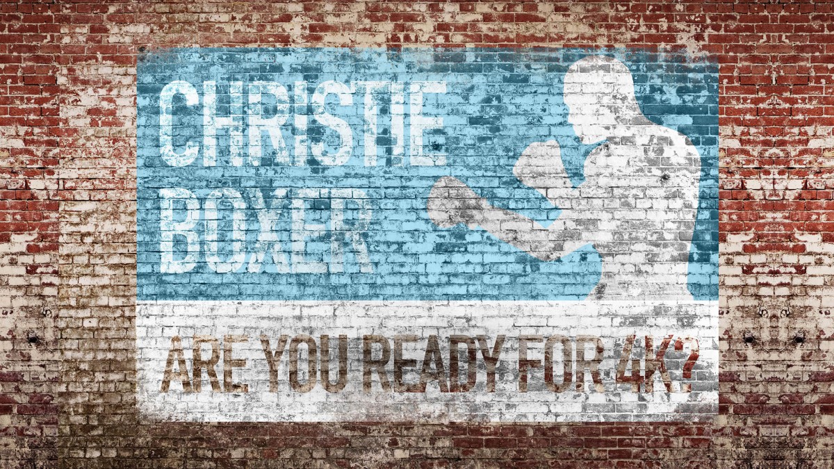
On forgotten walls in forgotten corners of our cities you can see them still, the hand painted advertisements that once kept the commercial wheels of the world turning. These signs built many brands we still recognise today – including Coca-Cola and Renault. Faded now, these ‘Ghost Signs’ are a reminder that Outdoor Advertising has, and always will be, of huge cultural importance.
Part of the city’s fabric
They’re a reminder too that as times change so do our cities. Large format lithographic printing meant paper posters took over from individual sign writers, 48-sheet poster sites began to line newly built trunk roads, and just as surely today’s DOOH digital signage will replace our street’s static posters.
You can see just how hard those original sign writers pushed the limits of their art. There are Trompe-l’œil renderings of chewing Gum packaging, finely wrought typefaces and carefully chosen colours. They’re not imposed upon the landscape but part of it.
And that’s worth remembering as DOOH becomes more ubiquitous, that if it’s to be truly accepted and if the messages it is to convey are to be absorbed, it also needs to work with the grain of the city not against it. The temptation may be to make DOOH content brighter and bolder in a mistaken pixelated arms race, but that would fundamentally misunderstand the nature of outdoor advertising and how it works.
DOOH Image quality matters to brands
DOOH has to be part of the brand building process, and brand building is slow and subtle. You can’t make friends by shouting at them; and every brand desires to be the consumer’s friend.
That’s why the same techniques and technologies Christie has learnt and developed in Cinema and in Outdoor Events and in Projection are so applicable to DOOH. DOOH displays and their content can’t just be about raw pixel power and eye-watering brightness. They ought to be about high quality images and messages that consumers take pleasure in viewing. Because those are the images they remember and act upon; the images that build brands. That inevitably means displays that have wide colour ranges and near-invisible seams like MicroTiles, and tight pixel pitches and wide viewing angles like the LED Christie Velvet Series and Christie’s LCD flat panels
The best advertising agencies out there know this, they know that their work, their carefully crafted images and words, intricate data strategies and contextual campaigns will fail in their aims if they are played out on displays designed only to shout and never to persuade.
That’s why so much effort is put into designing the ‘furniture’ aspect of displays and making it sympathetic to streetscapes and retail environments, because long experience has taught outdoor advertising experts that this approach is the most fruitful.
Part of the culture
The industry is already exploring the full possibilities of DOOH. Static ‘linear’ ads played on loop are being replaced by better thought-through dynamic content, integrated campaigns are replacing simple ‘illuminated posters’ a combination of smartphone Bluetooth and smart DOOH screens are leading towards targeted, personal messages.
It’s an exciting world, the possibilities are huge, but there’s a danger that in looking to the future the industry may forget one of the most valuable lessons of the past – that unless advertising becomes part of consumer’s culture, lives and landscapes it fails. You can shout your message from the sidelines as loudly as you wish, but intelligent messages, intelligently delivered using displays designed for the purpose will always have the last word.


